...
| Table of Contents | ||||
|---|---|---|---|---|
|
- Try to keep your visuals as simple as possible
- Dashboards work best when there is less ink on the page
- Keep your dashboards to the point: avoid huge numbers of charts and a large scrollable page
- keep calculation names short and descriptive, replacing spaces for underscores
- Keep your work-space tidy by using folders wherever possible
(1.) Only use calculations when you need them:
...
(4.) Use Tableau built-in functions (aliases, groups, sets, bins etc) wherever possible instead of calculations or make the changes in CustomSQL
But calculations are easier and aliases / groups / bins etc may be single-use
| Expand | ||||||||||
|---|---|---|---|---|---|---|---|---|---|---|
| ||||||||||
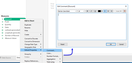
... consider this calculation to alter the alias of Tenure Type : (running over a 30M row optimised set:
Where aliases, being a Tableau object result in no execution time in order to generate the outputs, result is, far faster performance and zero impact to the underlying source. This object:
is the generally the cause of over 9 in 10 bottle-necks, slowdowns and server impacts yet is also one of the most easiest you can control. |
...
| Expand | ||
|---|---|---|
| ||
.. a presentation layer. All too often, Tableau is given Excel-centric nicknames "Excel on steroids" or "a more powerful Excel tool", and many of Tableau's user-base began there analytical lives with Excel or a similar spreadsheet tool, as such, most people therefore try to gain the same results from Tableau that they see with Excel, which often leads to terrible results further down the line. Tableau is NOT Excel and it does not behave like Excel either. The problem comes from the ease of use that Tableau provides, and users failing to understand the architecture of both tools. Only when explained that Tableau is nothing more than a presentation-layer with the bulk of the heavy-lifting taking place outside of Tableau, compared to Excel which does process every action, do users begin to see the bigger picture. This is discussed in greater detail in Tableau - is Not Excel: A High-Level Guide A Tableau Overview for the Excel User |
(9.) Limit your use of filters
...
| Expand | |||||||
|---|---|---|---|---|---|---|---|
| |||||||
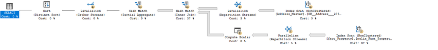
The ideal tool to slice and dice your data. They can be formed from dimensions, measures and calculations. They can use top n, bottom n, wildcard matching, type in and multi-select. Far more powerful (at least from a basic sense), than parameters, these filters really bring your visualisations to life. It's true, but these are amongst the biggest culprits for terrible data performance. Yet another one that fails to convey the impact to performance, you see, in order to build a quickfilter, Tableau needs to run a Select Distinct on the entirety of the column, it matters not whether the table contains a thousand rows, or one-hundred trillion, it still needs to perform this. Net result, as many users routinely plug Tableau into tens and one-hundreds of millions of rows of data, do you have any idea how much processing just one quickfilter takes to build. And then, the source-engine must start again for the next quickfilter. So if your table contains 10M rows and you have just five quickfilters, the data engine must run this query once for each filter, touching every record in the set:
So essentially, the data engine will have touched 50 million records from a 10 million record set. Now do you understand? There are however, two type of filter that don't touch any records:
I can offer two further solutions that will enable yo to go crazy with your filters: (1.) Either use a parameter to filter your initial set or (2.) Have your filters on just a single page (1.) The quote I put at the top of this page regarding needing to re-build the r&d report, well, part of the problem was that this was plugged into a 2 billion row set with around 8 quickfilters that needed to be generated causing huge slow-downs on what was already a 650ms network lag. However, the r&d entries were all Jira tickets, and frustratingly, users were only interested in a single ticket id each time they were using the report, with the average data size per ticket being around 3 million rows. Ok, so part of the back-end rebuild I mentioned was to partition the data by ticket id which hugely improved performance but, from the front-end, simply converting the connection to CustomSQL with a type-in parameter for the where-clause (this was eventually populated over a url-call) resolved the problem.
Therefore, by using CustomSQL and a parameter to reduce your set to that which is of interest from the outset, your quickfilters can be built against a much smaller set. (2.) The second alternative I can offer cam about from a pure accident: A second major drawback of the quickfilter is that if the same filter is placed on more than one dashboard or chart page but, enough time passes between initially building the filters on page/dashboard 1, where other actions have taken place enough to clear the cache for the filters, when moving to the alternate pages, the quickfilters must be re-generated with the same Select distinct query. I provided some consultancy to a company who just because they had 20 filters which took-up huge amounts of screen-space so, to save on space, we created a page of filters; it was awkward for the end-user to have to go back to the filters page when they wanted to adjust something, and I had to create an indicator to sit on every page to flag when and which filters were applied, but, the users were happy with it. Moreover, by moving the quickfilters to the one page, this meant that despite their number, they would only have to query the data just once per session, which allowed for an improved experience. |
(10.) Keep your visuals clean and your dashboards focused
| Expand | ||
|---|---|---|
| ||
Unfortunately, development requests from another user can often cause this very important point to fall by the wayside. Dashboards need to be as clean as possible - the maxim Less is More is absolutely necessary here. Tools such as Excel and to a lessor degree, Powerpoint have enabled users to attempt to cram as much information as possible into the tiniest of spaces. Users have been brought-up on a diet of "All on one page". This is terrible, for a number of reasons:
Visuals (charts and tables) also need to be as clean as possible. The less ink on the page, the easier a chart is to read:
|
(11.) Keep your work-space tidy
| Expand | ||
|---|---|---|
| ||
|