I’ve heard the term densification bandied around the communitiycommunity, but I’m still unsure what it is, how I might use it, and if I’ve ever actually seen it in use.
...
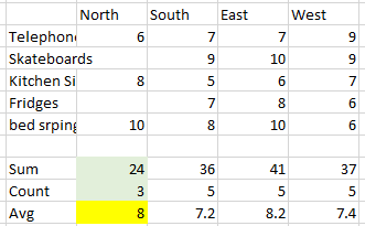
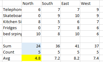
The problem is however, is that all tools will only plot a single value for each measurable, the space between the baseline and the value is empty - null if you will, as it has no meaning, the space (particularly in the case of a bar chart) is only provided for reference.
| Info |
|---|
"Densification is the process by which null valued empty space is made usable by providing meaning to all available marks between two or more real data points" |
| So rather than this | What you actually have is this |
|---|---|
|
|
...
So now we need to get a bit technical.
How to densify your data
You may well find a different method to densify your data, however at present, many other users will teach the bins method, which involves duplicating each row of your data; this is so you can present to Tableau a start and end point, and then bin the data to a size of 1 in order to generate incrementing numbers between the start and end.
| Note | ||
|---|---|---|
| ||
|
...
| Note | ||
|---|---|---|
| ||
To add more rows to you set so you are able to tell Tableau how to identify the base number. You may have numbers that begin at zero, but if these fields are filtered away from the set, then those base numbers suddenly no longer exist which will break any visualisation that is relying on them. |
The Datawonders Method
Similar to the bins method, this method also requires an alteration to your data-set: but we only need to add a single column, and a single row, instead of blindly duplicating every row
...
- Import the data to Tableau
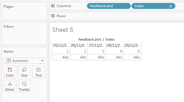
Create a calculation - call it what you like, I have named mine "feedback plot" and use this:
Code Block language sql title Feedback Plot linenumbers true Case [Dense] When 'Start' Then Today() Else Today() + 4 End
Note This is the key calculation needed to provide the densified output.
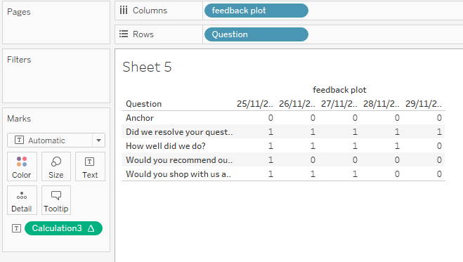
Tableau has a great function available for fields that contain predictable data: Show missing values, this is where Tableau is able to determine incrementing sequences to fill in the holes, however, this will fail if Tableau is unable to determine this. Dates are always sequential and always incremental such that Tableau has no trouble at all in identifying the sequence and plugging the holes. The bins method instead uses bins of size 1 to generate the same output
Now drag this Feedback Plot calculation to columns, changing the date format to discrete - this should create two dates: the current date and one 4 days from now
Next, right mouse select the feedback plot object (pill) and choose Show Missing Values - notice how Tableau has included the dates between the current date and the one four days from now
Tip Keep in mind, your data does not contain values for this newly plotted data - Tableau has just generated columns from nothing
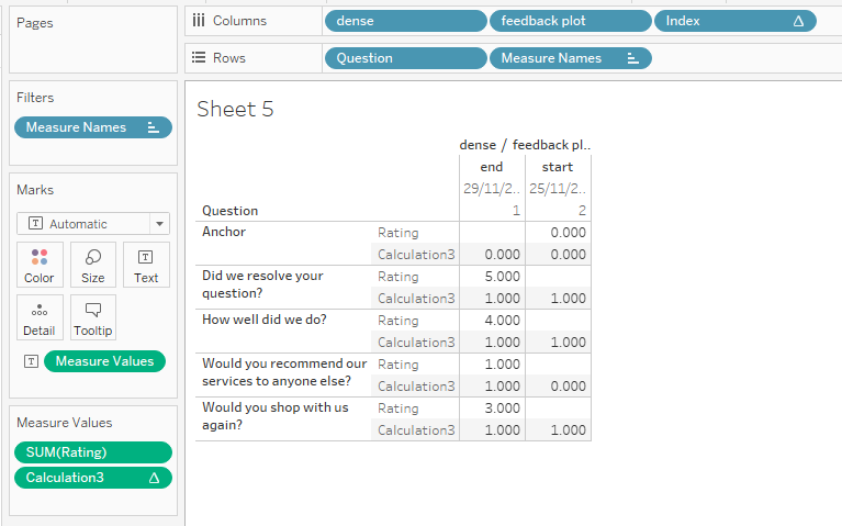
- Just as a guidline guideline - this is not needed for the final plot, create an Index() calculation and drag this up next to the feedback plot field converting to discrete, notice how Tableau has numbered each of those date fields from 1 thru 5:
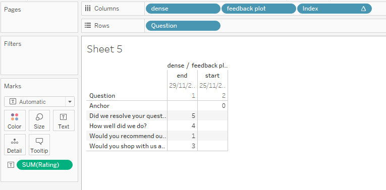
- Now drag your Question field onto the rows to see a similar output to that above
- Dragging the dense field onto the plot, you will be able to get an idea of the numeric positions of your data - this is important for you to test your output is correct
Create a Window_Avg calculation on the Rating field - average's (or median's) Being aggregated, you will only ever want to know the average or middling value; filtering to a single customer, this will be functionally the same as a max or min, but on a set, using max or min will only show the result of these absolute selections, for which your data will always be incorrect.
Code Block language sql title Window_Avg If Window_Avg(Avg(Rating)) < Index() Then 0 Else 1 End
And drag this calculation onto the view
- It all seems a bit broken at the moment, removing the dense field will straighten things out

What we're looking for here is that the count of 1's per column sums to the value given for the Rating field - Now we're onto the final steps:
- Remove Rating from the Measure Values card
- Remove Index from the column
- This leaves us with the mark-up:
- Now switch the chart type to shape, changing all of the marks to the 5-pointed star shape
- Right-mouse select the Window_Avg calculation (called Calculation3 in my screenshots), change to discrete and drag onto the colour field and set:
- 1 = Yellow colour
- 0 = Grey colour
- Finally, right-mouse select the row labelled Anchor and hide the value
- And right-mouse select the feedback plot pill and untick Show Header
...