Despite having their roots in the late 1990's, waterfall charts are beginning to see a resurgence post 2015, yet despite this, Tableau cannot natively create a waterfall.
In this article, I shall walk you through building both the simplest waterfall chart, right through to the engineered chart of measures type.
The Simple Waterfall
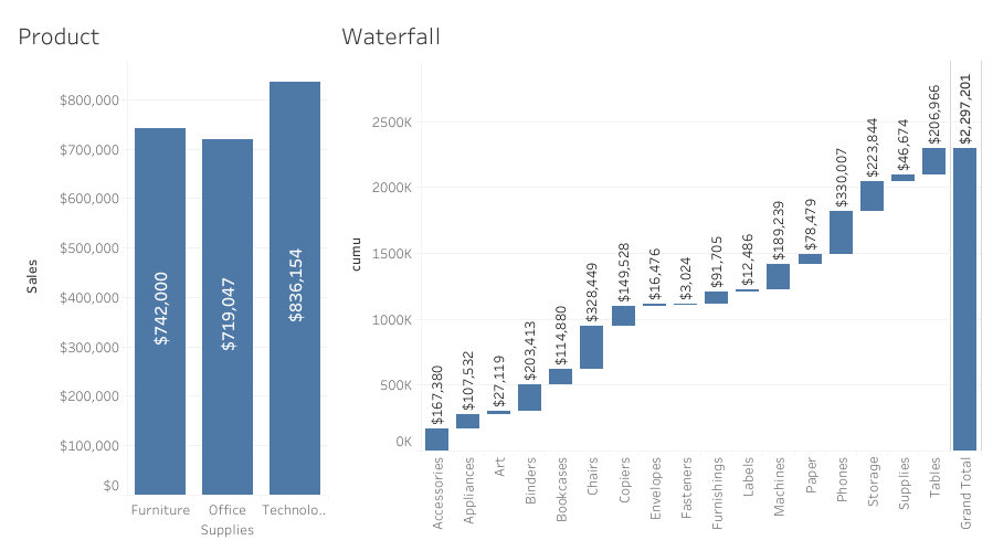
Remember when we used to want to know how a single measure breaks-down across the attributes of a dimension?
Click the image to open/interact and download
Building this is as simple as creating a Gantt chart and simply reversing the value of the measures:
- Drag Sub-Category to Columns
Create a cumulative calculation: Running_Sum(Sum(Sales)) Drag this to Rows
- Switch the chart type to Gantt from the Marks Card
- Create a negative calculation: -Sum(Sales) and drag this to the Size on the marks card
- Add the totals: Analysis > Totals > Show Row Grand Totals
Hop over to the Show me how to build that page - video 17 to see this.
The thing is though, what if you don't want to see the output of a single measure across the dimnesions? A bar chart will probably suffice here.
What if what you / your requirement is, is to see how the sum of different measures breakdown?
Maybe you want to know how the different company levers such as Sales Value, Cancellation Value, Cost of Goods, Overheads etc group together to provide your bottom-line Gross Profit
The basic architecture of Tableau (and indeed most visualisaton tools), is to hang a value from a partition, or rather, to show how a value is broken-down across a group of attributes as is the case of most of your charts; removing the the dimension(s), removes the chart framework, and with it, the tools' ability to build a chart.
In the case of Tableau, this lack of a framework, has Tableau placing each aggregated mark value atop each other; the result: A mess!
So how do we do this?
By building an engineered waterfall framework
The Engineered Waterfall
Before reading further, please ensure you have read my article on densification Lets Talk: Densification (to ensure you are using the most efficient method), even if you are already comfortable with the concept.
The engineered waterfall (and indeed any engineered chart) allows you to work around some of the limitations of Tableau's native functionality to achieve seemingly impossible charts; such as curved arc's and Sankey diagrams.
In the case of the waterfall, we are no longer relying on Tableau to make the plot, instead, we ourselves are simply telling Tableau what to plot as per usual, and, where to plot it.
It is important to realise here that this fully-flexible method of building means that, once you have taken control of the chart build from Tableau, that you are fully responsible for the output.
Image Hint:
Click the image to explore the dashboard, and download the workbook
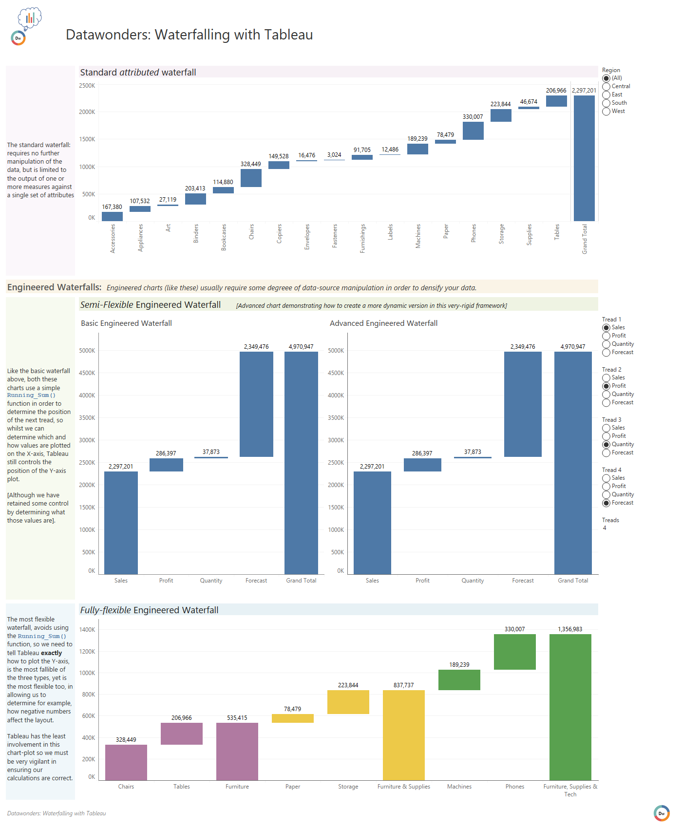
For ease, the build is demonstrated in the video below, and I do recommend you download the complete workbook to understand how to build the fully-flexible waterfall too.
Video Tutorial: Building the Semi-Flexible Engineered Waterfall
Follow-along with this step-by-step tutorial to build the semi-flexible waterfall
(05:47) / (37 MB)