Blue and Green: What do they mean?
Upon first entering the development screen, one of the first items most users notice is the different icons used to denote different data objects, and the colours: blue and green.
You could be forgiven for assuming that blue = dimensions and green = measures, after all, this is how they normally appear.
However, this is only part-right:
Blue = Discrete data
Green = Continuous data
But, what is continuous and discrete?
- Discrete data is data that persists throughout the set, such that the object can be used to categorise your measures
- Whereas Continuous data is that which flows from 0; it may not necessarily be sequential, but it does continue
A great example of the two types is that of Date:
Dates make for excellent examples for the very reason that they can be equally difficult to consider:
| Discrete | Example |
|---|---|
Year | 2000 |
| Month | May |
| Day | 02 |
| Weekday | Monday |
| Time | 15:31:43 |
| Week Number | 18 |
This is because all but Year occur each year period for example (yyyy-mm-dd):
Look at these two dates: 2002-02-18 & 2003-02-18
Both could be categorised to:
- 18th February
- February
- Day 18 of February
- Day 49 of the year
Contrast this to continuous data:
2002-02-18: The complete date is continuous, as we enter the 19th (2002-02-19), we are now no longer able to categorise data from a future period against that of the previous period.
So, why is this important?
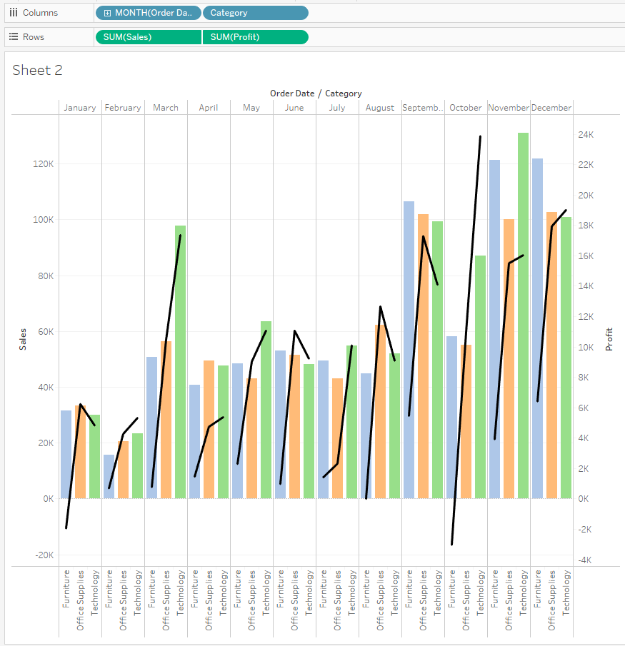
First-off, it will help you to understand the visual cue that Tableau Software have built into Tableau but second and most importantly, it will help you to understand how Tableau is working and why you cannot plot multiple lines against side-by-side bar charts:
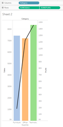
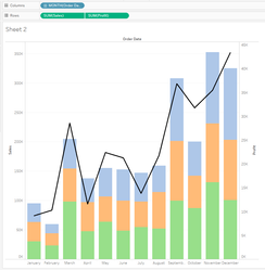
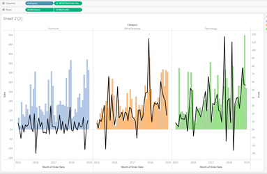
| 2. One discrete dimension | 3. One discrete dimension | 4. One discrete dimension with date as Continuous |
|---|---|---|---|
 |
|
|
|
When more than one definition object (dimension) has been added, Tableau has no choice but to plot the data-items as discrete, this too is the same for the line which you would ideally prefer to plot over time: Tableau is simply plotting by Month | Upon removal of the Date dimension, Tableau plots the values aggregated to only the Category object | With the removal of the category from the layout, this is what chart 1 looks like but with the addition of the Category to break-down the bar value | Converting the Date dimension to continuous has allowed a continuous plot over time but broken-down by category; removal of Category from the columns will result in the same chart as Chart 3, but plotted over a discrete period |
Icon Explanation
| Explanation | |
|---|---|
| Real-time data-source connection: same symbol used for all data-types eg: database, flat-file, Excel, clipboard |
| Extract: Data is a snapshot from a different source. Your workbook size will include the extracted data and, you must refresh this source as regularly as the original source to remain present |
| Published data-source: Connection could be either real-time or extracted but runs exclusively from a Tableau Server or Tableau Online |
| Folder: Used for object organisation only |
| Geo: Data has been identified as having a global function eg country, state, town etc |
| String data. |
| Hierarchy: Objects have been organised into an expanding / contracting hierarchy |
| Continuous Date |
| Continuous Date-Time |
| Numeric |
| Bin: Continuous data have been categorised for counts: needed for histogram |
| Grouped: One or more discrete measures have been grouped to create a new measure |
| Set: User-defined filter has been created and retained for future use |
| Boolean |
| Continuous Date |
| Continuous Date-Time |
| Equals sign (demonstrated with a numeric symbol here for clarity) indicates the object is a calculation |


