How Does Tableau Work?
- Steve Martin
So, what is Tableau?
The tool we use to visualise stuff init!
Chances are, you haven't hit this page by accident so you probably are already aware of the awesome power that Tableau can bring to your data, but what IS Tableau - and Qlikview/QlikSense, PowerBI, Spotfire, Looker, SSRS, R Shiny, Business Objects etc
Tableau, et al are nothing more than visualisation platforms, which is to say, they only visualise source data, regardless as to where the data is- and are therefore unable to write data. This is in contrast to Microsoft Excel, Google Spreadsheets, OpenOffice Calc and other spreadsheet tools that do create writable and therefore cross-platform readable data.
What this means is that even though we can do some great things with many of the visualisation tools available today, generally speaking, all calculations that are written, and thus built into the project, largely remain only accessible to the project that they were written, with a few notable exceptions:
- Tableau: The following objects expose data and calculations/calculated data to Tableau proper, allowing them to be used as either primary or supplementary data-sources to other projects
- Packaged workbooks (tde & hyper - v10.5+)
- Published data-sources
- Tableau: Export to CSV - Packages all the data and results of materialised calculations as static data and saves as a csv.
- PowerBI - linked to an Excel workbook
- Business Objects universe
(I'm sure users of other software will add to this list)
So why do we need to know this?
Well, before we can begin to understand what Tableau is doing, we need to understand what Tableau is doing.
Tableau (and the other tools), visualise the data which means that your reports will be the only way in which 90% or more of your users will get to see your data: So when your report is suddenly showing unexpected values, we as the developers of the report are suddenly held to account; the data and it structures are always considered to be correct, so if there is a problem, even when your report has been signed-off and accepted as the "single-version of the truth", the problem is usually placed squarely at the feet of the developer and/or owner (if they differ or the dev has since skipped-town).
Ok, this sounds like a bit of a rant, not sure where you are going with this...
It's funny you should say that because I felt the best opener to this piece was to demonstrate that which most of us analysts and devs often face.
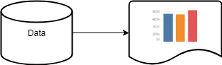
High-Level flow of many Visualisation Tools:
So you've had your rant, now what?
Back to my question: What does Tableau do more precisely, how does Tableau do it? And, why does this matter?
This matters for a couple of reasons, mainly for the consideration of optimisation but also, so we as analysts and developers can produce better reports, because anyone can create a chart, and with the relative ease of Tableau, Excel and Looker (and others), anyone can begin to put together a dashboard; but, not everyone from the off has the Best Practice knowledge to be able to weigh-up what looks great like an info-chart, and what is necessary without harming the source.
Yes, you read that right: Harming the source -
New users and end-users alike conclude that everything they see is taking place inside of Tableau, that when a calculation is written and applied, that this calculation is being evaluated by Tableau when in actual fact, very few calculations are evaluated by Tableau (this is mostly limited to table calculations as these are processed against the materialised data):
The High-Level flow above is very high-level, the truth of Tableau differs much more, consider this chart:
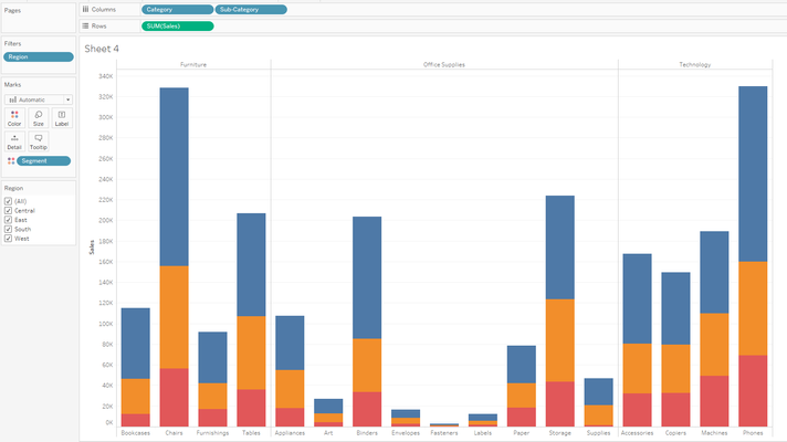
Tableau will convert this view to an SQL query, something to the effect of:
The source (database engine / Microsoft Jet) will execute this and return just the result back to Tableau. From here, Tableau simply plots the output in accordance with your mark-up:
Tableau Process Flow:

So now we can see what it is that Tableau is doing - at least from a high-level, we can begin to use this information:
- To investigate problems as they arise
- Identify the most likely areas for poor performance
- Work-out the best charts, dashboards, stories for the job in hand
- Consider the performance impacts of the dashboards
- Design appropriate optimisations such as indexes, to properly support our work
- Design dashboards that make best use of the built-in objects to avoid unnecessary querying
- Design reports that can include better data quality reporting
Tableau Early Strap-line:
Answer questions as you think them
Unfortunately, with the relative ease of development, and lack of understanding of how Tableau works, over time, calculations have been employed where thy are not suited such as:
Displaying static text mixed with calculated outputs eg this calculation:
'Average Sales for this month: ' + Str(Sum(Sales))
And then added to the above view would result in:
With an execution plan of:
| Without Calculation | With Calculation |
|---|---|
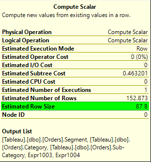 | 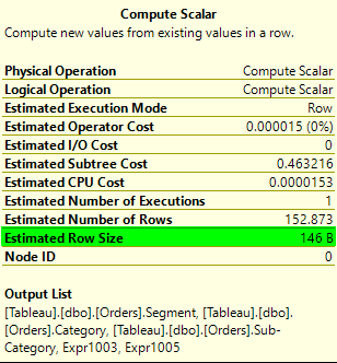 |
Both versions are returning 152 rows but, the additional text in the with calculation mode has inflated each row by and additional 59 bytes or 67% more so the amount of data needed to travel over the network pipe will be 22,192 bytes (21.67 KB) rather than 13,224 (12.9 KB). So, a small piece of of avoidable text has inflated the amount of data travelling over the network by 11KB and this is for just 152 rows of a 9,000 row data-set, scale this up to the millions, billions and in the case of big-data trillions and beyond, and this will really begin to take hold.
Returning to the albeit pre-2015 strap-line, how is it possible to answer a question at the speed the user thinks it, when it takes upwards of 60 seconds for Tableau to render?
Which brings me full circle:
More often than not, slowness in a report is often blamed exclusively on Tableau when the real culprit is usually poor dashboard design coupled with poorly-optimised or un-optimised data sources.
I hope this quick dip under the hood has helped clarify how Tableau works and where data problems and/or performance issues can arise.