Lets Talk: Densification
I’ve heard the term densification bandied around the community, but I’m still unsure what it is, how I might use it, and if I’ve ever actually seen it in use.
Densification is the method(s) used to bridge the gap in the base architecture of a visualisation tool. In short, densified data allows you to specify and control exactly how you want your data to be plotted.
99% of the time, you will be able to achieve your desired output using the built in functionality of your tool, therefore, you may never need to densify your data, and you have probably seldom come across visuals that are using densified data, but knowing the how and why might help convert that impossible to-do in Tableau yet easy to pull-off in Excel chart into an easy in Tableau when you know how.
Consider this chart:
Question: What are the two items needed by any visualisation tool in order to determine and draw the plot area?
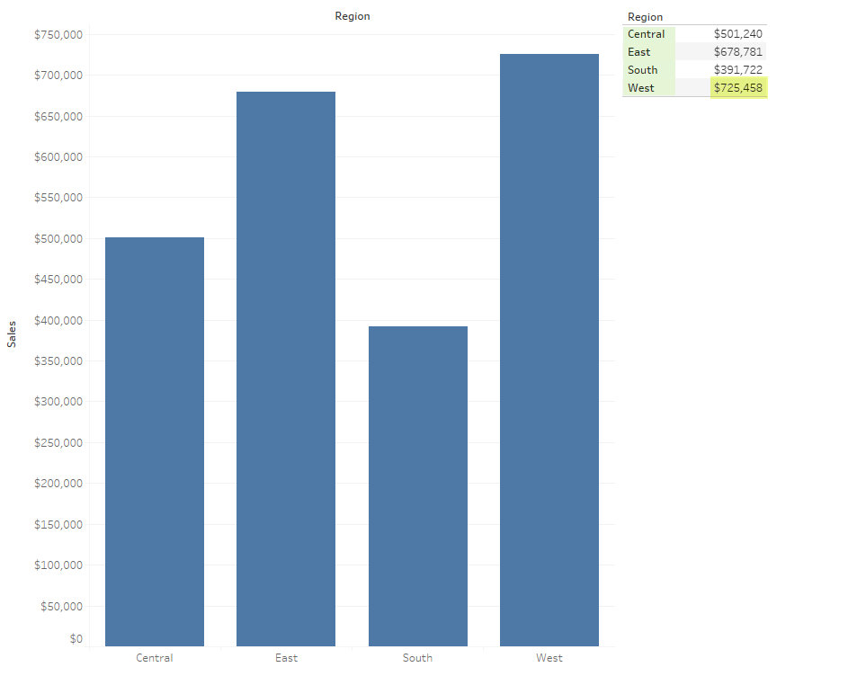
Answer: The maximum measure value (725,458) - highlighted yellow in the supporting table, and the number of measurables (4) highlighted green
With these two items, your tool - Tableau in this case can determine that all remaining values to be plotted will not plot outside the value range, neither will there be more items to plot.
The problem is however, is that all tools will only plot a single value for each measurable, the space between the baseline and the value is empty - null if you will, as it has no meaning, the space (particularly in the case of a bar chart) is only provided for reference.
"Densification is the process by which null valued empty space is made usable by providing meaning to all available marks between two or more real data points"
| So rather than this | What you actually have is this |
|---|---|
|
|
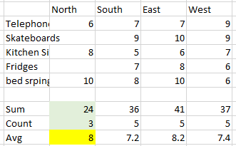
See the difference? For the North region, we have two empty (Null) fields in the first table, whereas the second table, these have been populated to zero; and this is the second problem and one in which we need to be aware as to what we are doing, as an average over populated rows, even where the field is zero has skewed the count and subsequent average.
Ok, I think I follow you, but why would I want to be filling-in the holes in my data - those nulls are there for a reason, and I still don't understand what I would actually use densification for.
So going back to the earlier diagram, imagine if you only had a single number - the result, but needed to access the empty space between the baseline and your number in order to give it some meaning, this is where you would use densification; trouble is, Tableau is unable to natively densify your data to access the empty space.
So lets take another example:
Imagine you have feedback from a questionnaire and user ratings 1-5:
| Question | Rating |
|---|---|
| How well did we do? | 4 |
| Did we resolve your question? | 5 |
| Would you shop with us again? | 3 |
| Would you recommend our services to anyone else? | 1 |
The above data has but a single value for each row, Tableau has no way of knowing what the base value is, so shall default this to zero, after which, the rest of the plot is elementary. This can be easily demonstrated by a bar chart:
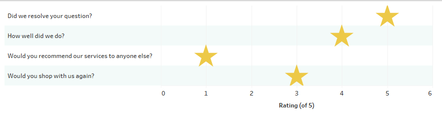
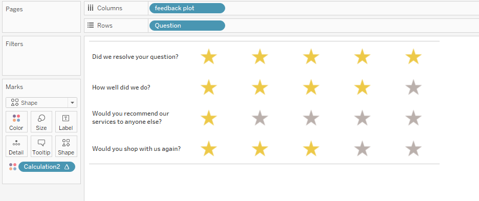
This is far from clear, and probably not what you, and certainly what your users will want to see, what you shall really be looking for, will be a proper feedback marker, that highlights the numbers of stars out of 5 that the users have rated, not just the upper star:
| Normal Output | Densified Output | Result |
|---|---|---|
As we can see here, Tableau has prepared the plot field for only one value, which will become aggregated output matching the above chart |
But after we have densified the data, Tableau now thinks there are 25 values to plot comprised of 5 members on the rows and then 5 values for each measure - we shall get to the "anchor" seen in this view in just a moment |
So now we have the 5x5 plot space available to us, a simple calculation |
Oooh! Now I get it, not sure how you did it though.
So now we need to get a bit technical.
How to densify your data
You may well find a different method to densify your data, however at present, many other users will teach the bins method, which involves duplicating each row of your data; this is so you can present to Tableau a start and end point, and then bin the data to a size of 1 in order to generate incrementing numbers between the start and end.
The problems with the bins method are that:
- It is slow, noticeably so, especially when used with sets greater than 1 million rows
- Uses a lot of unnecessary server resource, impacting use for others
- Needs a large data pipeline
- Creates a single-purpose data-set (being duplicated you would have to use filters (costing even more time) to use the set for anything else)
- Prevents using any aggregation but average
- Requires some other calcs and heavy lifting in order to work
In light of the above, for this tutorial I shall be demonstrating an alternate method that will provide a densification model, which negates all of the above problems, we'll call this the Datawonders method.
About that Datawonders Method
I actually developed this method back in 2014 for the Measures-only waterfall, long before I knew densification was a thing, and some years before I happened across the bins method.
Ho hum ![]()
The key to densification is..
To add more rows to you set so you are able to tell Tableau how to identify the base number.
You may have numbers that begin at zero, but if these fields are filtered away from the set, then those base numbers suddenly no longer exist which will break any visualisation that is relying on them.
The Datawonders Method
Similar to the bins method, this method also requires an alteration to your data-set: but we only need to add a single column, and a single row, instead of blindly duplicating every row
This means that your set is completely re-usable for other work, your calculations shall continue to work as expected and regardless as to the size of your data, you shall only be increasing this size by 1 row, which keeps data pipelines low and server resources stable.
We shall re-produce the feedback stars from above.
Original Table
| Question | Rating |
|---|---|
| How well did we do? | 4 |
| Did we resolve your question? | 5 |
| Would you shop with us again? | 3 |
| Would you recommend our services to anyone else? | 1 |
Modified Table
| Dense | Question | Rating |
|---|---|---|
| End | How well did we do? | 4 |
| End | Did we resolve your question? | 5 |
| End | Would you shop with us again? | 3 |
| End | Would you recommend our services to anyone else? | 1 |
| Start | Anchor | 0 |
Modified due to the addition of our 'helper' or densification row and column
When we begin to build this, we shall be using the "Dense" field to provide the start and end points of our data, notice how the Rating value for the desnse row is zero. This one row, is equivalent to the duplicated rows of the bins method.
- Import the data to Tableau
Create a calculation - call it what you like, I have named mine "feedback plot" and use this:
Feedback PlotCase [Dense] When 'Start' Then Today() Else Today() + 4 End
This is the key calculation needed to provide the densified output.
Tableau has a great function available for fields that contain predictable data: Show missing values, this is where Tableau is able to determine incrementing sequences to fill in the holes, however, this will fail if Tableau is unable to determine this. Dates are always sequential and always incremental such that Tableau has no trouble at all in identifying the sequence and plugging the holes. The bins method instead uses bins of size 1 to generate the same output
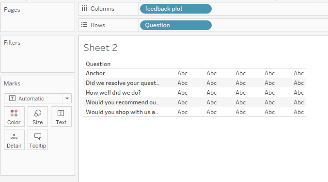
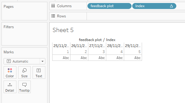
Now drag this Feedback Plot calculation to columns, changing the date format to discrete - this should create two dates: the current date and one 4 days from now
Next, right mouse select the feedback plot object (pill) and choose Show Missing Values - notice how Tableau has included the dates between the current date and the one four days from now
Keep in mind, your data does not contain values for this newly plotted data - Tableau has just generated columns from nothing
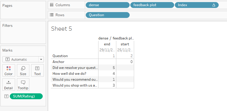
- Just as a guideline - this is not needed for the final plot, create an Index() calculation and drag this up next to the feedback plot field converting to discrete, notice how Tableau has numbered each of those date fields from 1 thru 5:
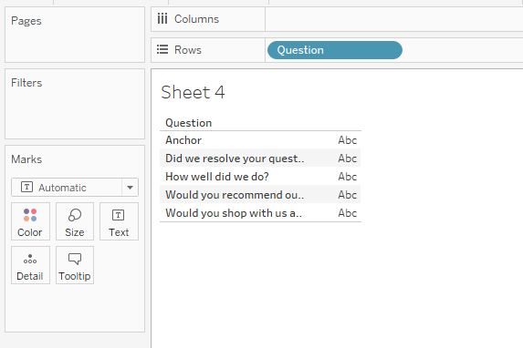
- Now drag your Question field onto the rows to see a similar output to that above
- Dragging the dense field onto the plot, you will be able to get an idea of the numeric positions of your data - this is important for you to test your output is correct
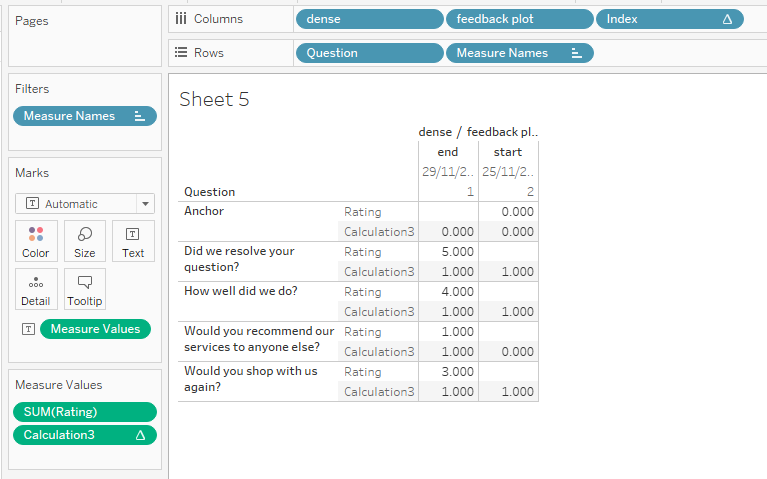
Create a Window_Avg calculation on the Rating field - average's (or median's) Being aggregated, you will only ever want to know the average or middling value; filtering to a single customer, this will be functionally the same as a max or min, but on a set, using max or min will only show the result of these absolute selections, for which your data will always be incorrect.
Window_AvgIf Window_Avg(Avg(Rating)) < Index() Then 0 Else 1 End
And drag this calculation onto the view
- It all seems a bit broken at the moment, removing the dense field will straighten things out
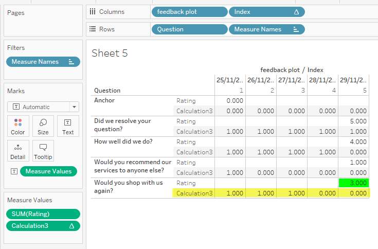
What we're looking for here is that the count of 1's per column sums to the value given for the Rating field - Now we're onto the final steps:
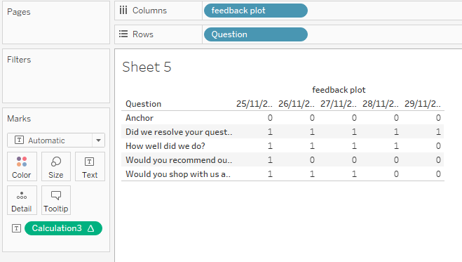
- Remove Rating from the Measure Values card
- Remove Index from the column
- This leaves us with the mark-up:
- Now switch the chart type to shape, changing all of the marks to the 5-pointed star shape
- Right-mouse select the Window_Avg calculation (called Calculation3 in my screenshots), change to discrete and drag onto the colour field and set:
- 1 = Yellow colour
- 0 = Grey colour
- Finally, right-mouse select the row labelled Anchor and hide the value
- And right-mouse select the feedback plot pill and untick Show Header
Follow through with this video walk-thru (no sound)
Densified Stars (feedback ratings) 03:01
Densification in a nutshell